Anatomy of Orderflow at the Tick Level
Many people asked why would anyone want to analyze the charts at the tick level. Wouldn’t that be a waste of time since such high frequency activities are not likely going to have any long term impact.
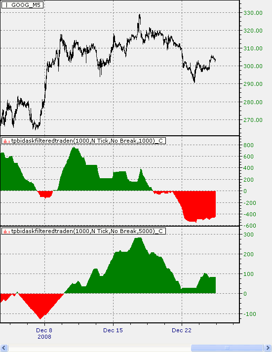
Let’s take a look at this chart first.
Top pane is Google stock price at 5-minute interval, since the beginning of December 2008.
Second pane is, the histogram of the moving score of 1000 trades, where each trade involves at least 1000 shares. A trade at the asking price gets a score of 1, and a trade at the bid price gets a score of -1. As you can see, the result is a momentum indicator providing some insights into the strength of the price series.
Third pane is, the histogram of the moving score of 1000 trades, but each trade involves at least 5000 shares.
Notice how profound that the lowest and highest swing points in the price matched perfectly with the histogram in the third pane.
It is a simple example showing large sized orders, in general, move the market. This information, however, cannot be derived from the price series. One has to dig deep into the tick data to have that extracted.


